Spring & Summer Color Palettes
In Living Color
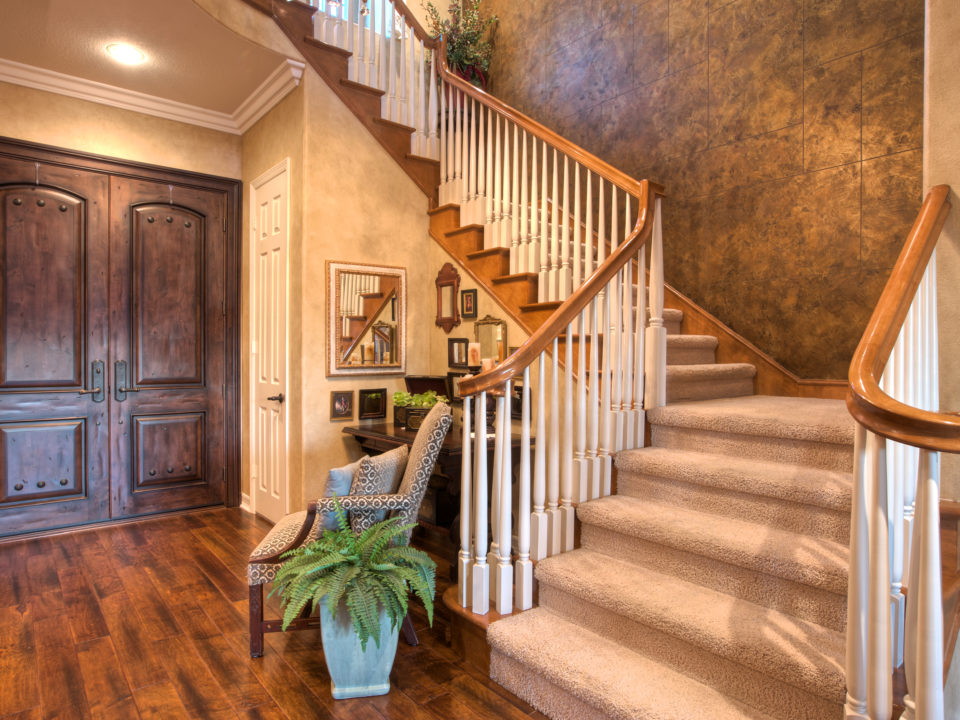
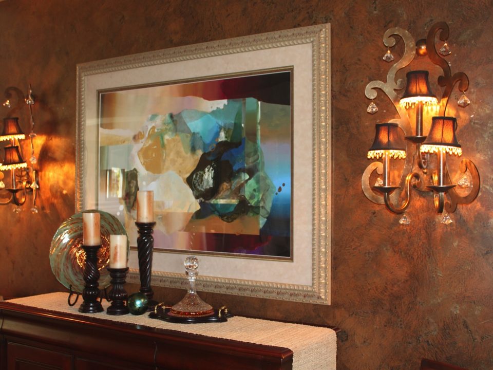
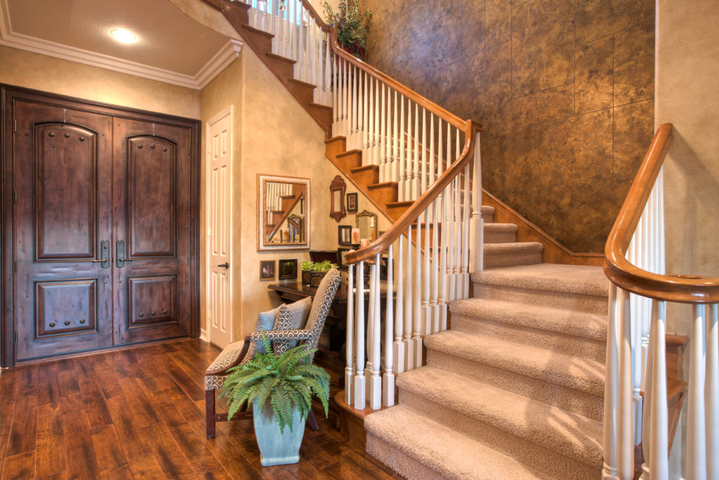
As spring continues, we wanted to focus on spring and upcoming summer color palettes for your home and decor. As faux finishing experts, we understand the importance of choosing the right colors for your space, which is why we’re here to help—we even teach a Color Theory Workshop.
Color palettes are important for anyone working on faux finishing because often times the right color palette is the difference between a boring, dull finish or a bright, creative finish. When starting off with a palette it’s best to think about the colors you already have in your home and why you want to change them. Ask yourself questions like:
- Are you satisfied with the current colors?
- If you’re still transitioning from winter to spring/summer do you want brighter colors to accent the warmer weather?
- Are you trying to focus on accent pieces to enhance the colors on the wall, just focused on enhancing the walls to compliment the accent pieces, or wanting to focus on the entire room?
The Bright is Right
 Once you’ve narrowed it down through those questions, it’s easier to start picking your spring and summer color palettes. Brighter colors are usually best for one’s home when the weather is warmer because the house feels lighter and happier.
Let’s take an in depth look at some inspirational ideas from HGTV. HGTV details a list of surprising spring and summer color palettes for living and dining rooms that you’ve never tried before. Not only is it a good list but a surprising one. Black, white, and powder blue… who knew? What’s great about HGTV is that they really do provide amazing mixes and matches to contrasting and sometimes complimentary spring and summer color palettes.
Think Themes
The beautiful thing about color palettes is they have the power to showcase a theme without looking as if you’re throwing a themed party through tacky patterns and decor. For example one of our favorite HGTV palettes is the Moody Blues and Browns. This idea is great because it truly gives a nautical theme, almost like mimicking a ship through colors, without typical nautical patterns and decor.
Another favorite is the Mint Green and Pink. Before you think those colors don’t look good together, think again. Not only are they complementary to each other but with the right décor, your house can be turned into a contemporary oasis without looking like a kid’s room. Trust us, it can be pulled off and so can another favorite, Bright Berry Hues.
Bold & Beautiful
Now we know Bright Berry Hues might not be everyone’s favorite, and we kinda don’t blame you. However, let us make our case. This is a gorgeous spring and summer color palette particularly for those who are bold. But be careful! With this kind of palette you have pay close attention to your décor, otherwise it’ll look too Willy Wonka. Again it’s Bright Berry Hues NOT Blueberry Room. So with decor focus on softer pieces and let the colors take focus.
You can check out the rest of HGTV’s inspirational moments, and don’t forget we also offer a Color Theory Workshop course. So if you’re interested in seeing how colors can enhance your projects with firsthand experience—whether painting or faux finishing, don’t hesitate to get in touch to learn more about spring and summer color palettes, find out what our current course schedules are, or sign up for the Color Theory Workshop.